TXTbooks Branding & GFX
TXTbooks is an artist-run independent publishing initiative and risograph studio created in 2014 by Robert Blair, Thomas Colligan, Rose Wong, Nichole Shinn, and Kurt Woerpel.
We publish anything we like, aiming to keep it as a space for more unfiltered 'care-free' expression to supplement what may lack in our day jobs. We table at Printed Matter's New York and LA Art Book Fairs each fall and spring (respectively) as well as other fairs in the city, country, and world. We currently have zines held at the MoMA, Whitney Museum of American Art, Metropolitan Museum of Art, New York Public Library, San Francisco MoMA, The Pratt Library, The RISD Library, Letterform Archive, Library of the Printed Web, and a few more. Our zines are for sale on our webshop at TXTbooks.us, at printedmatter.org, and at a number of book shops around the world.
Here I am displaying selected graphics I have designed for the project with some rationalization on how it grew into a larger system.
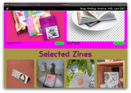
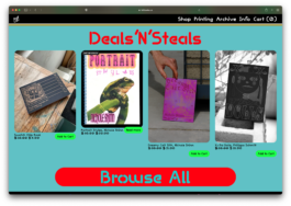
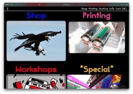
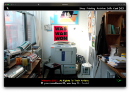
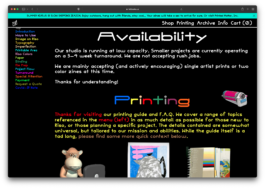
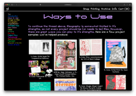
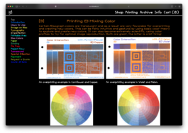
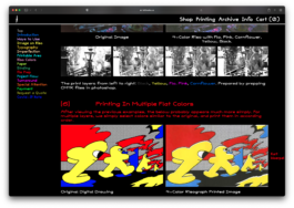
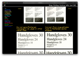
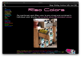
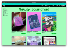
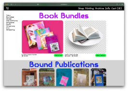
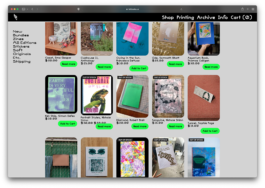
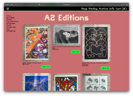
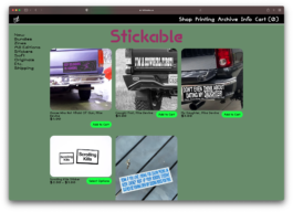
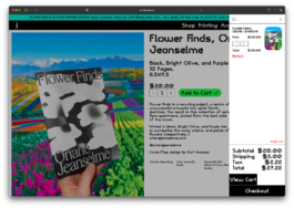
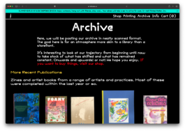
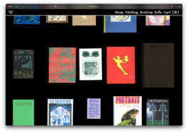
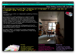
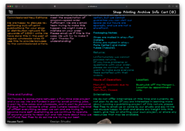
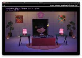
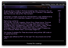
TXTbooks.us Website
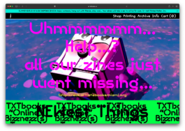
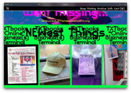
Evolving web design and web mastering for the group. Our website is an easy place to start, striding the line between many uses of our house font, or design styling applied in print and digital, our zine imagery, and our vibe. Built on an ever-layered LayTheme template with in house shop, tutorials, and other resources built in. Meant to balance business with chaos and play.
TXTbooks GroTXT
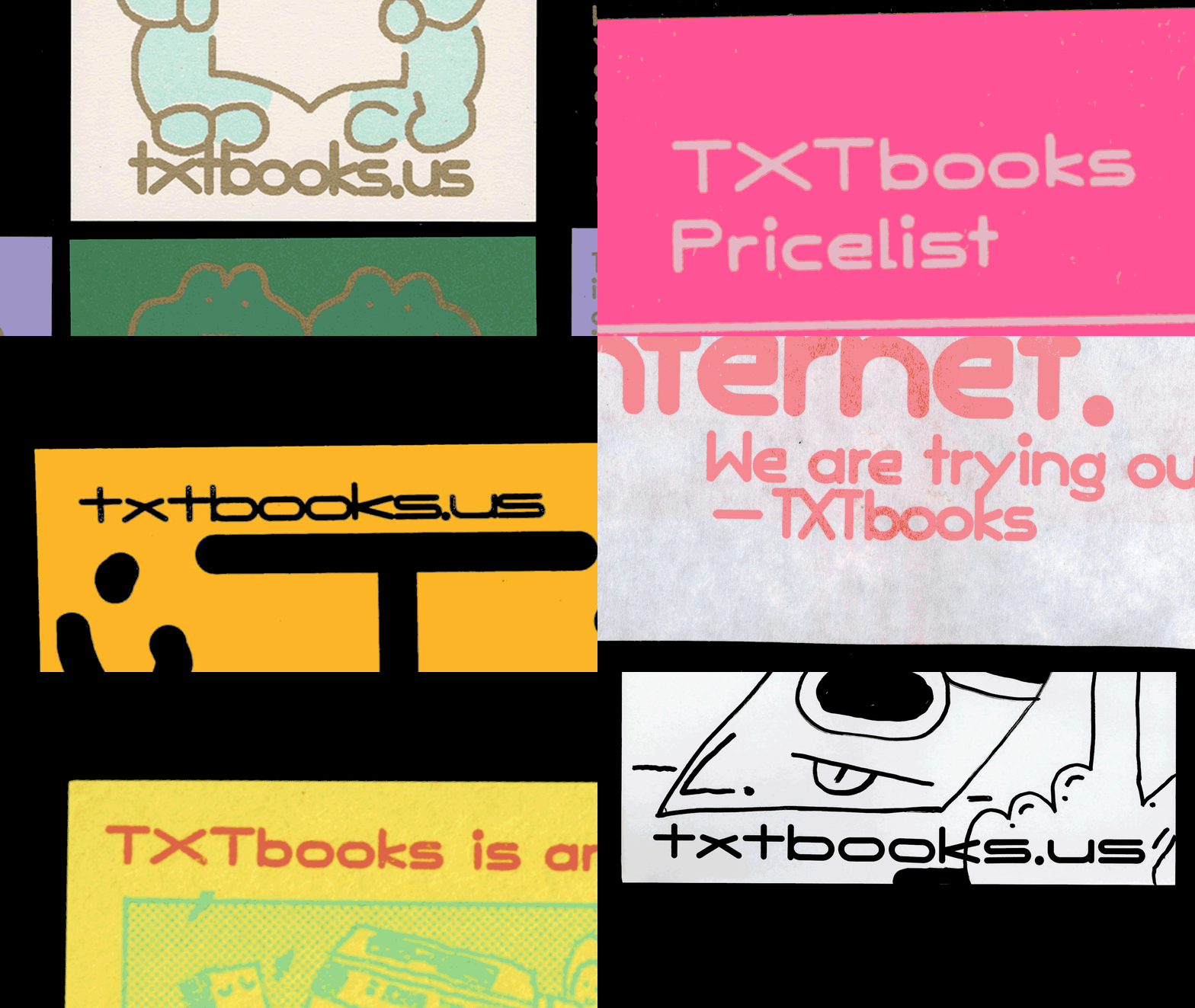
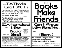
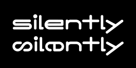
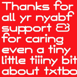
Our visuals are very much based on using our house font, TXTbooks GroTXT, a clumsy rounded font I have slowly developed since 2015. The idea was to contrast more austere (self-serious) publishing projects with something very goofy and fun. The hope was to create something new in the visual ecosystem of art book publishing, which at the time of beginning was very much dominated by severly seriffed Larish-Alte, or severely modern, or severely punk typography. We can use any weight in any way, loose or tight. Always match weight of illustration to weight of type (if you can.) and basically go Outback Steakhouse Mode (No Rules, Just Right.) Because the type is so specific, it creates a nice bucket to separate our house visuals from our zines, so they can very much exist in separate (but complimentary) zones.The rounded nature was meant to provide a way for any level of simple lifework to connect into the font. The off-kilter character set was created to be able to kern tightly together in optical spacing to underlap and stack to create new on-the-fly ligatures. More specific uses can be seen in our printed ephemera.
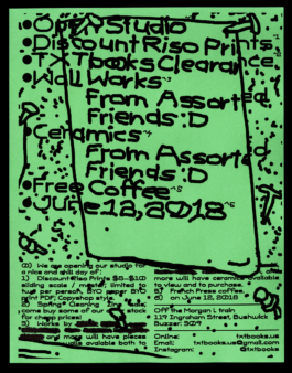
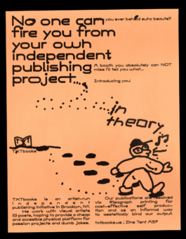
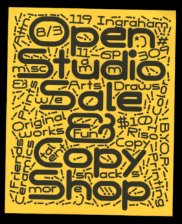
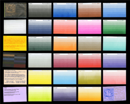
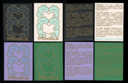
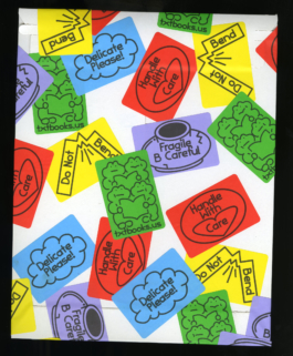
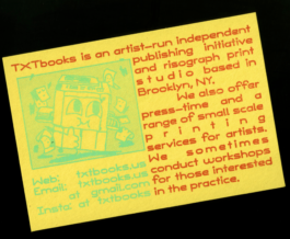
In-House Printed Ephemera
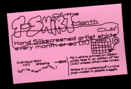
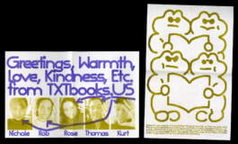
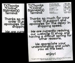
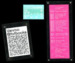
Selected printed materials designed For TXTbooks since 2014. This includes posters, price lists, ink lists, thank you slips, and more.
TXTbooks Banner Ads
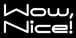
For a while I made banner ads for our own website to serve as buttons. These were two standouts.


TXTReader
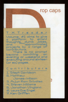
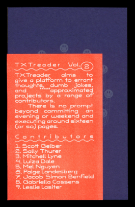
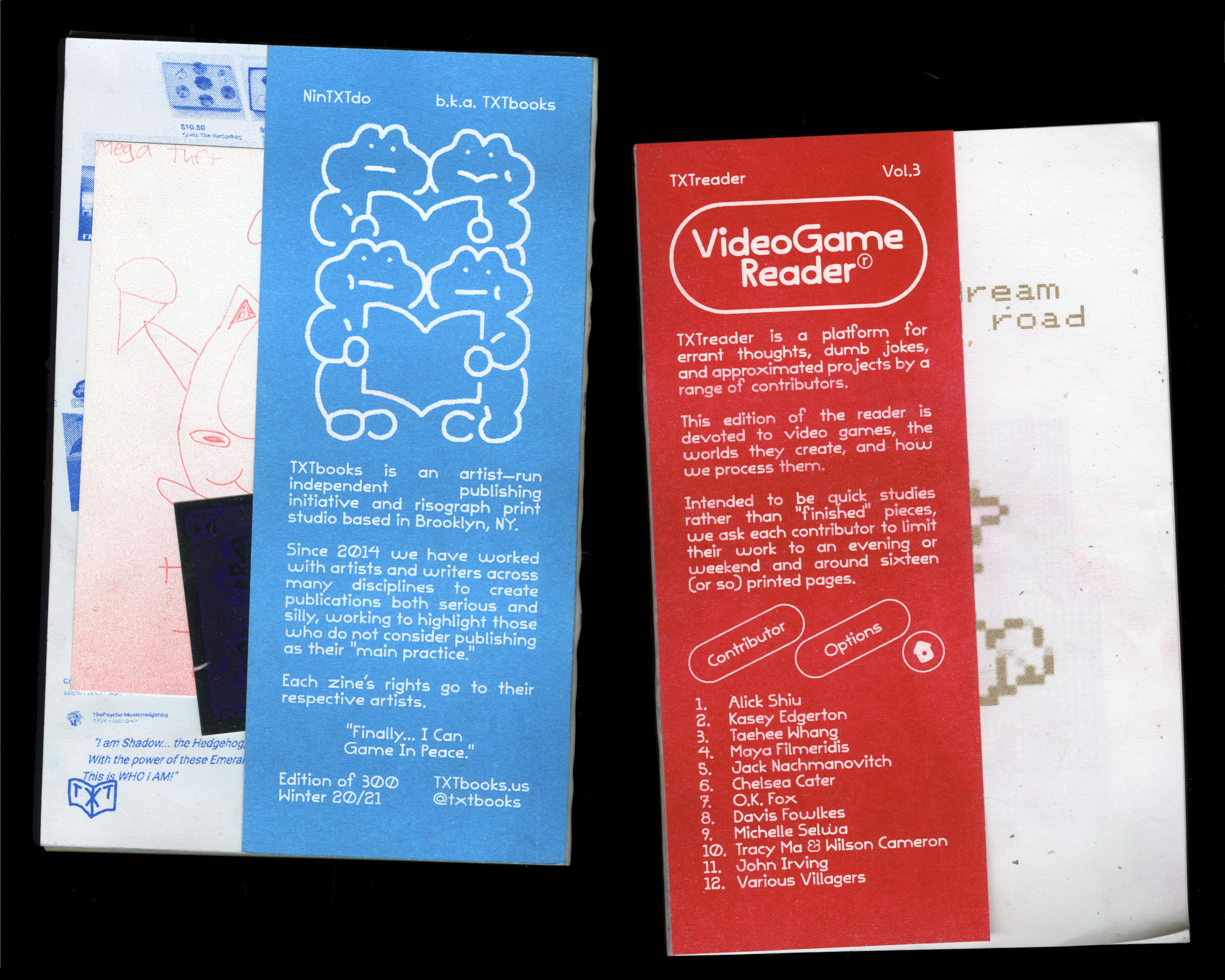
We produce an annual zine compilation called TXTreader which we design via templated contributor zine-as-signature sections. We then sandwich between two half sheets and perfect bind w/ an open-glue spine. These books are co-curated and produced w/ Robert Blair.
Selected Instagram Posts
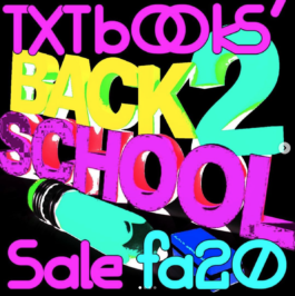
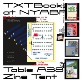
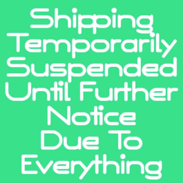
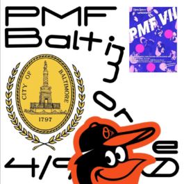
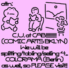
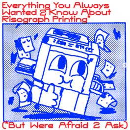
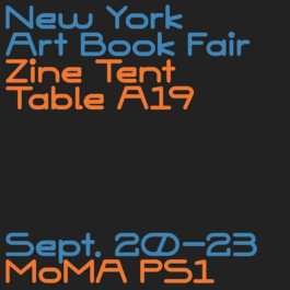
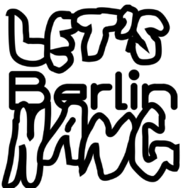
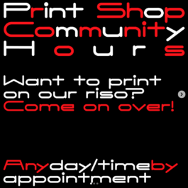
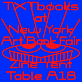
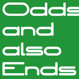
Zine releases, Deals, Travel Guidance, Cryptogram, Fair Announcements.

Remote Workshop Graphics
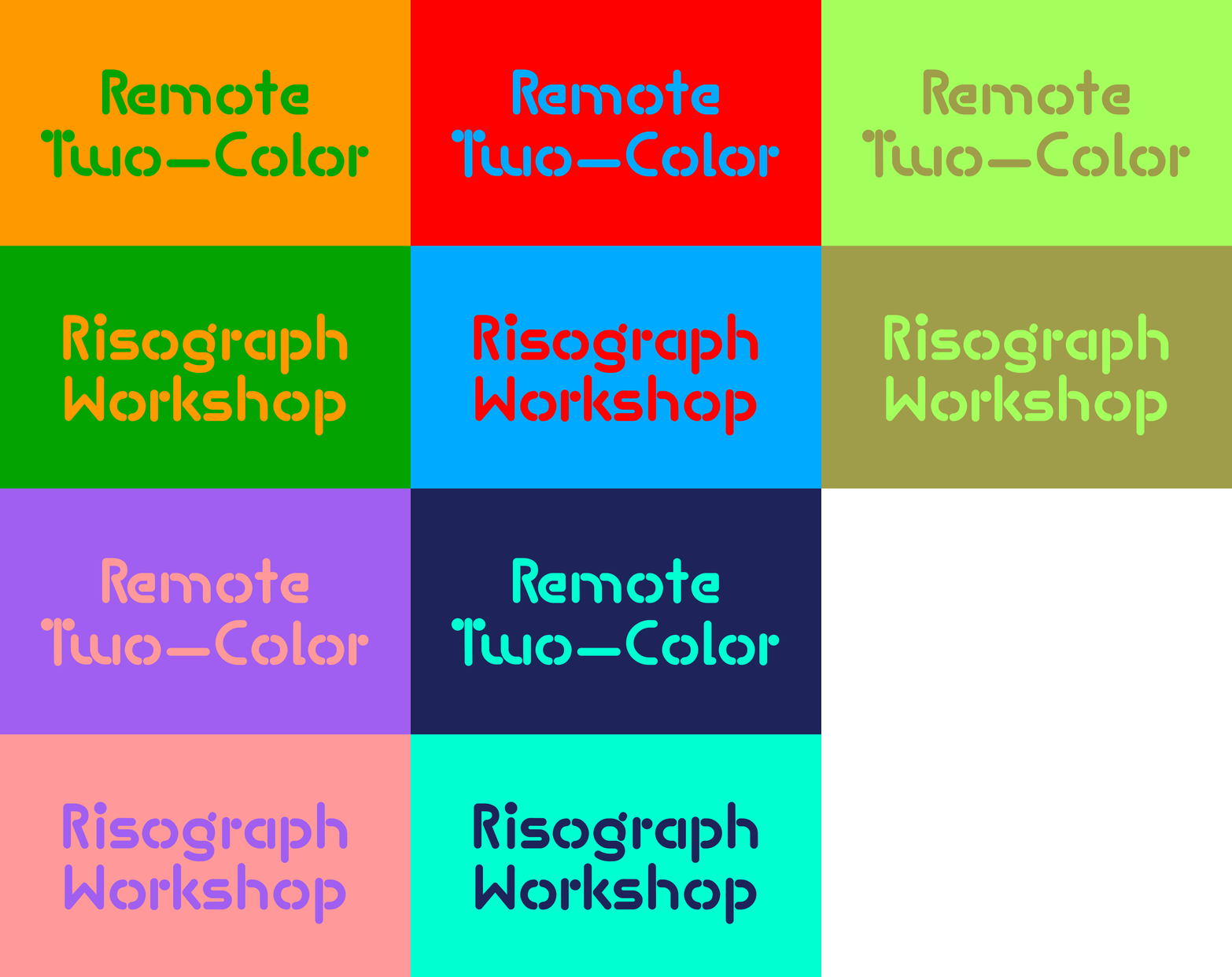
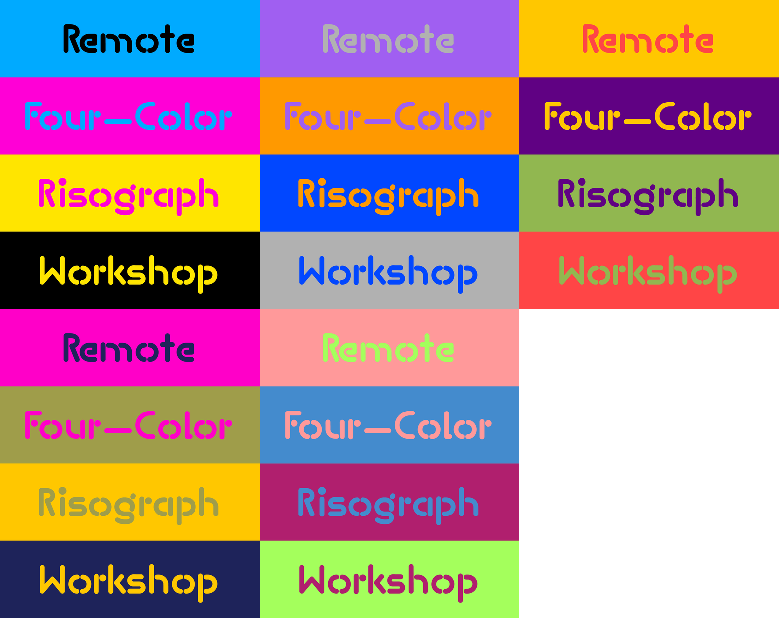
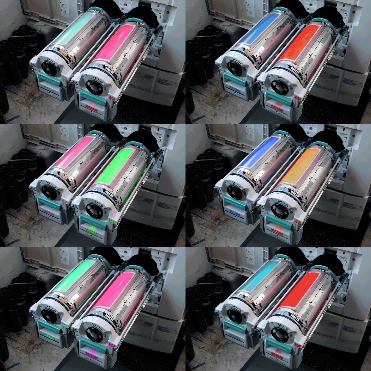
Informed by Riso colors we own, using the stencil cut of our font.
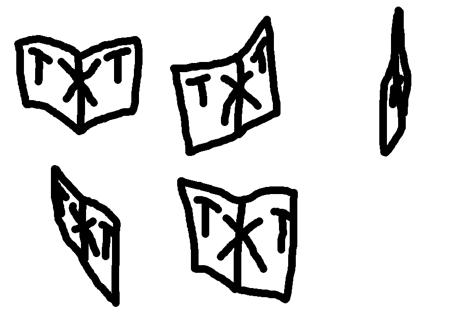
Original Mark
Our original mark, created in 2014 with an evolving set of animations.

Our Space
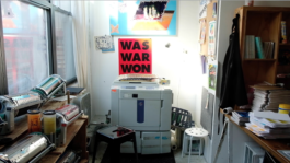
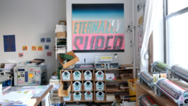
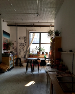
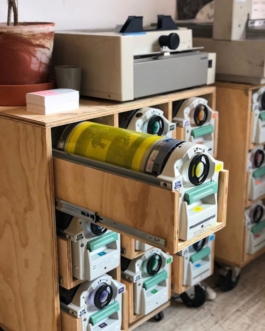
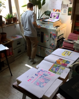
Our workshop in action, incase it piques your interest.
