This is a space where I will be posting works for smaller clients -- things that don't deserve their own freestanding bucket for whatever reason.
INCWORKS
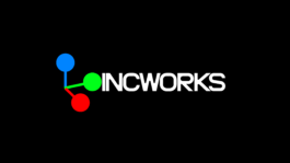
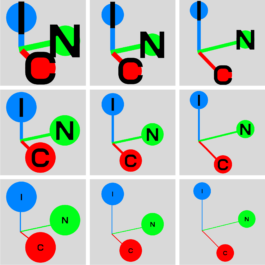
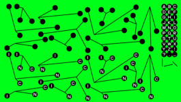
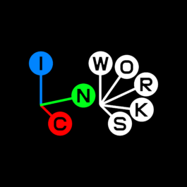
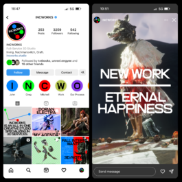
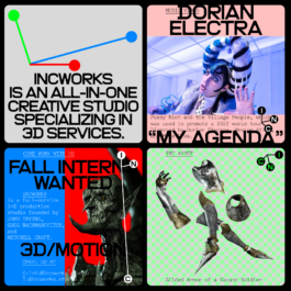
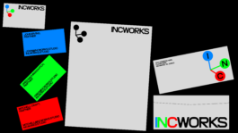
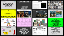
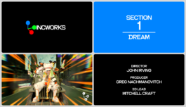
Identity and studio materials for INCWORKS, an all-in-one 3D production studio founded by John Irving, Greg Nachmanovitch, and Mitchell Craft. The mark takes the standard 3D XYZ axis and modifies it into a variable INC axis to represent the studio partners.


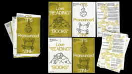
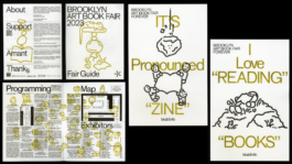
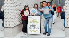
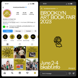
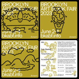
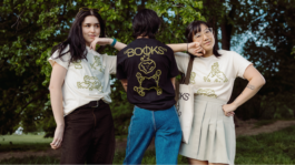
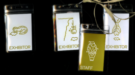
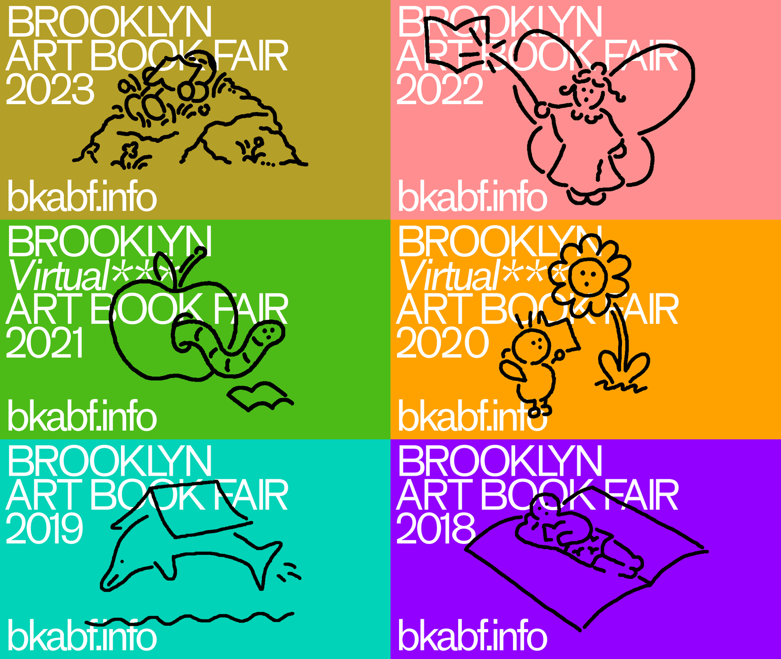
Brooklyn Art Book Fair 2023
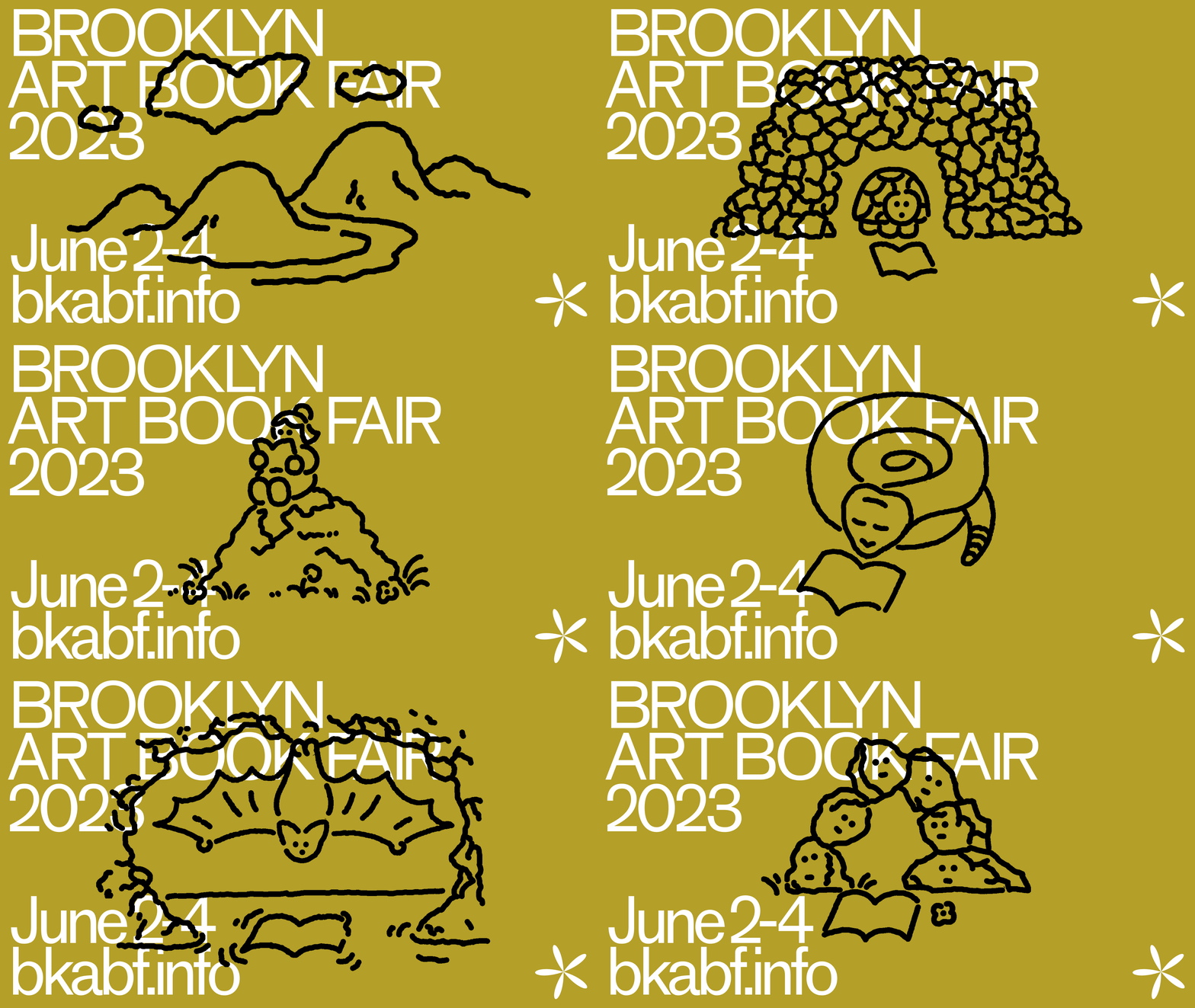
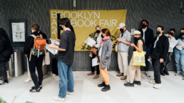
Identity, website, social posts, fair guide, and ephemera for Brooklyn Art Book Fair. The 7th annual Brooklyn Art Book Fair is dedicated to showcasing publications, original artwork, and editions by underrepresented and emerging artists and writers. BKABF seeks to invert the typical book fair model by providing tables and space to all of its exhibitors free of cost. The project is initiated by Endless Editions. Completed in conversation and collaboration with Thomas Colligan via TXTbooks with financial support from the Amant foundation. We (Thomas, TXTbooks, myself) have contributed graphic support pro-bono to the fair since 2018, maintaining a consistent but evolving graphic system each year in a gradual manner. All Illustrations by Thomas Colligan.
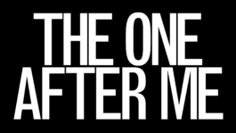
The One After Me
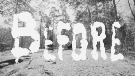
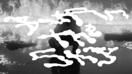
Title lettering and type for Seinabo Sey's ‘THE ONE AFTER ME’ — a short film by ColorsXStudios visualizing and extending Sey’s sonic storytelling and narratives. You can watch the whole cut on ColorsxStudios site. Thanks CD/AD Felix Huettel.
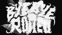
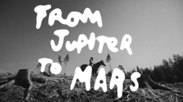
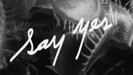
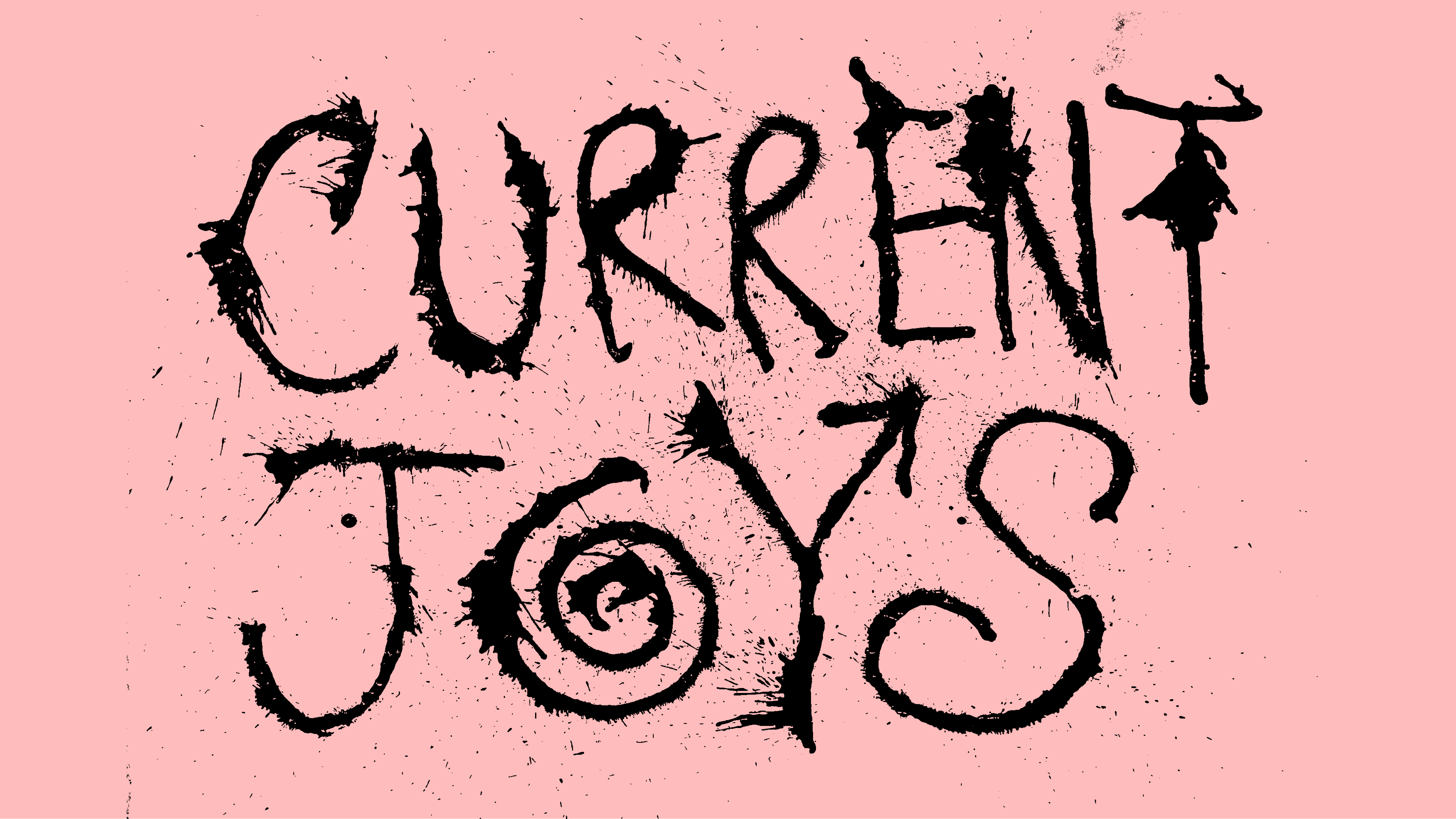
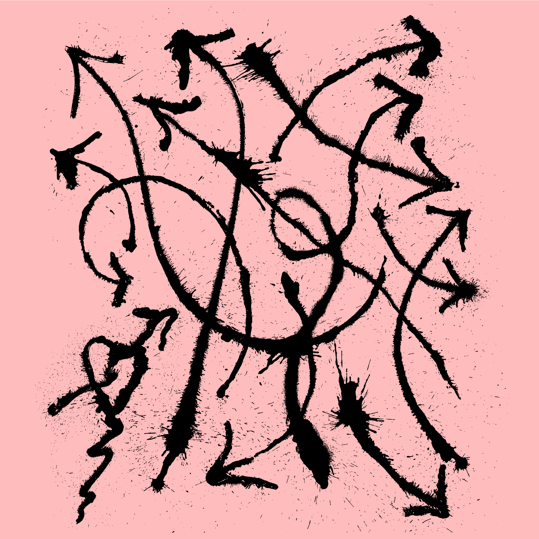
Current Joys (Unused)
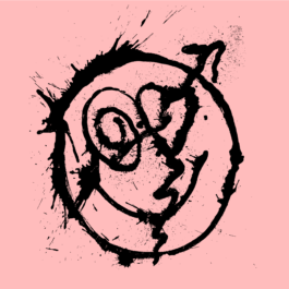
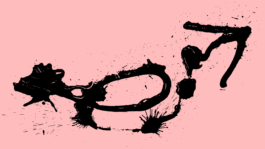
Ink spray lettering and graphics for the indie rock band Current Joys. Ultimately these went unused.
56 Bones
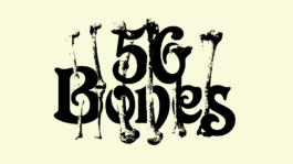
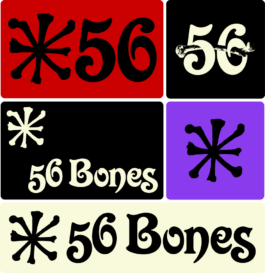
Identity for 56 Bones, a film production company run by Dakota and Dylan Pailes-Friedman. The direction pairs photocopied & composited bones with ITC Victorian, a swashy font with forms reminiscent of bones and joints... plus a color palette inspired by Black Sabbath.
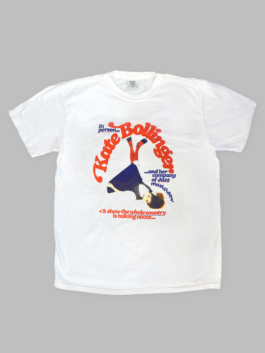
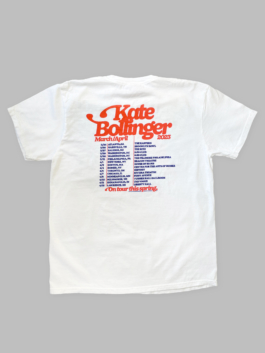
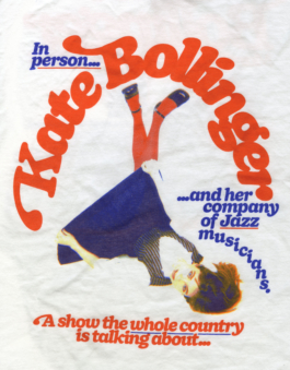
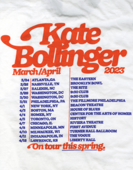
Kate Bollinger Spring '23 Tour Shirts
Shirts in support for Kate Bollinger's Spring 2023 US Tour with Tennis. The design features a customized version of DOYLE by Sharp Type with 70's inspired swashes that are inspired by the classic Fender guitar headstock. Photo by Myles Katherine.
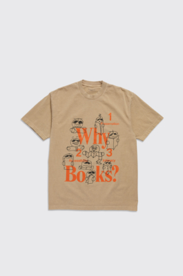
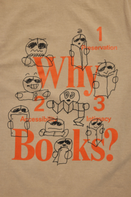
Actual Source Why Books? 2.0
Actual Source invited me to reinvision their iconic 'Why Books?' shirt in Summer 2022. I drew a series of responses inspired by my time as a student in the Independent Publishing electives at Pratt Institute, taking iconic zine formats from assignments and archives to explore the joys, quirks, and mysteries of artist-made books.
AP Studio Website
AP Studio is a production house founded by Alexis Piqueras. We created a site to showcase their sprawling archive of projects and highlight their roster of clients and collaborators. The site is a balance of a contact sheet, index, and simple 'insta' feed stylings. The project pages automatically generate their display style with three column down to one column layouts based on the amount of assets in each project, allowing the AP team to simply drop in assets and let the site figure out how to display them. The user can also toggle these sizes manually. This toggle idea is present on various other pages to accommodate different view preferences. Original identity by Helios Capedavilla. Development by Aarati Akkapedi.
Alexander
Design, icons, and typography for Alexander, a new editorial app. Mostly this was a job of re-skinning and reorganizing information within modules that had already begun development, but were not quite right visually. Art Direction by Look, Inc. Completed in conversation/collaboration with Levin+Riegner. Development by Levin+Riegner.
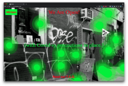
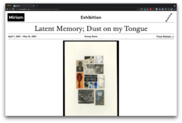
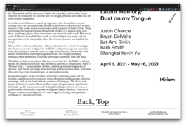
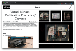
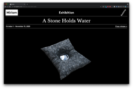
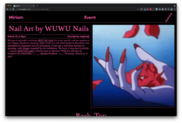
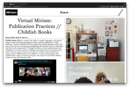
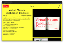
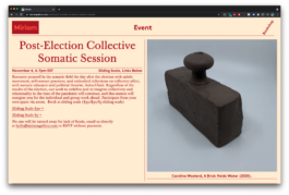
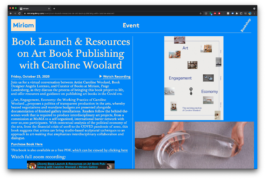
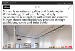
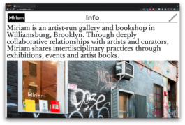
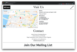
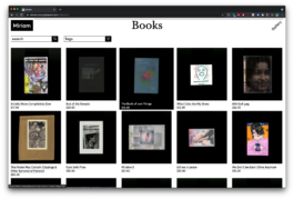
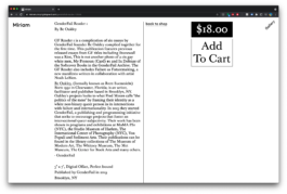
Miriam Gallery
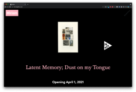
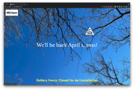
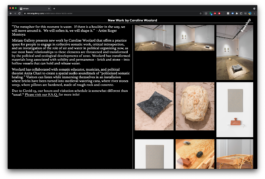
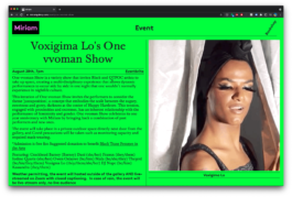
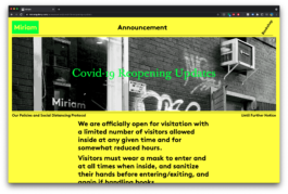
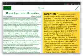
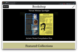
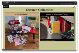
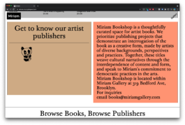
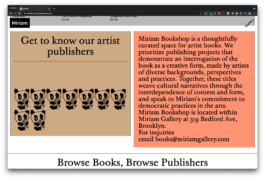
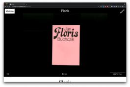
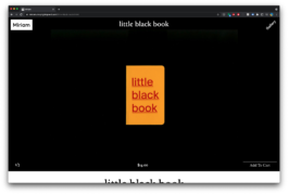
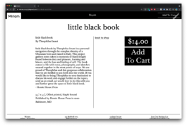
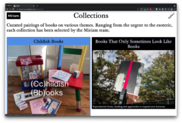
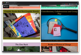
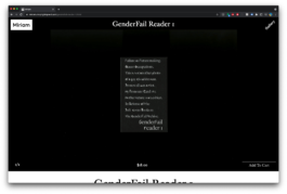
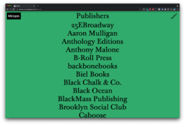
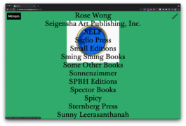
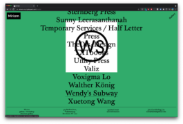
A website designed and built for Miriam Gallery, a new space in Williamsburg. The space features highly varied programming along with artist exhibitions and a highly-integrated bookshop. We wanted to create a design that could accommodate & generate new designs built straight into data fields on Airtable, creating and modifying templates as data fields were populated with different input styles. We then built a matching/contrasting web shop for their bookstore. Conceived of and completed with Robert Blair (Co-Design, Photo Direction) and Aarati Akkapeddi (Development) in 2020.

HAIR Shop Icons
Some Icons for HAIR's web shop.


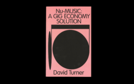
Nu-Music: Book Cover
Cover design for David Turner of Penny Fractions, a music-industry newsletter focusing on phenomenon of explotation withinthe indie-music-meets-tech-monopoly-streaming landscape. The crux of the essay was about some parties getting more than others, so I created a grotesque and imbalanced musical note.
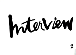
Interview Magazine
I redrew the logo for Interview Magazine in 2018. It was based on the old logo. I did around 200 options but the second one was the best.
Look Studios
Identity work for the agency Look Studios. My thought here was to use "Look" as a sort of command, to produce animations that tried to direct and capture your eyes, you looking for/at "looks."

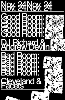
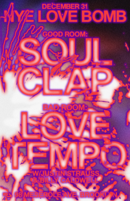
Good Room
A micro-residency of posters completed over the series of a month under invitation from Braulio Amado who was on vacation at the time. Special thanks to Lauren Murada, Josh Houtkin, and of course Braulio Amado.

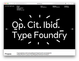
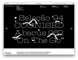
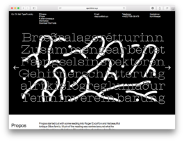
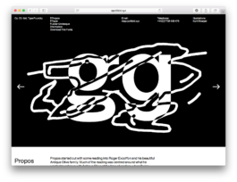
Op.Cit.Ibid.
Illustrations for Kia Tasbighou's type foundry OP CIT IBID's launch page. Each set was created in response to the goals and inspiration for each typeface and to work as a comic to accompany their display.
Heck Sticker
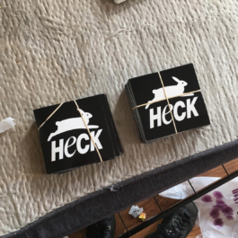
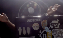
A sticker for Heck, a now defunct house venue in Brooklyn. From the entrance of the space (in a low basement) you could see a PETA poster hanging in a neighbor's bedroom. The picture here right is from DREAMCRUSHER's PBS Live appearance on Sound Field. When I saw this performance it reminded me that this sticker existed. I'm not sure I ever actually got one once they were printed?
Penny Fractions
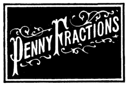
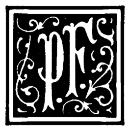
Typographic mark/icon/header for Penny Fractions, a weekly newsletter by David Turner which focuses on labor in the music streaming business. David was super interested in wood block print pamphlets, so I built a typographic mark based on an old sourced material, rearranging and adding to character forms.
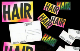
Hair, The Salon
Identity for Hair, the salon by Daniel Moon. Completed in conversation with Daniel Moon and Nicole Reber. Risograph printed as business and post cards.
